Healthcare facilities are notoriously difficult to navigate. Endless hallways with nearly identical rooms make it challenging to find a destination, adding unnecessary stress to an environment that is already stressful enough. This issue is especially concerning within senior care facilities as it could cause significant harm to some of the residents.
It doesn’t have to be that way, though. Designers of senior care facilities have prioritized wayfinding so that residents can easily navigate their new home. Healthcare Facilities Today recently spoke with Aaron Woodward, senior designer, Kolano Design on what things designers should consider when it comes to wayfinding within senior care facilities.
HFT: What are your key considerations when designing wayfinding systems for senior care facilities?
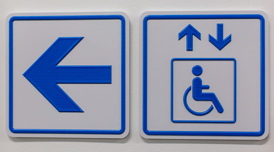
Aaron Woodward: Signage should use large, high-contrast fonts, uniformity in messaging/symbols, colors, and typography. Strive for simple and intuitive sign layouts with minimal decision points in wayfinding. Consider usage of distinct visual landmarks to assist with navigation and orientation.
During the design process, explore where exceeding the minimum ADA guidelines for signage can better accommodate the unique needs of senior residents. For instance, the Braille Institute has developed a family of fonts to improve legibility and readability for individuals with low vision. For seniors in care facilities, they are unlikely to learn to read Braille as their vision goes. But using a highly legible and font with distinct character features can have an immediate impact on their well-being today. Three versions of Atkinson Hyperlegible font are available for free from the institute’s website with an option to donate to further their efforts to positively transform the lives of those with vision loss.
HFT: How do you incorporate evidence-based design principles to enhance navigation for seniors, including those with dementia?
Woodward: With signage, it’s best to adhere to clear sightlines, visually reduced clutter and simple messaging. Introduce other visual cues where practical to help with spatial orientation.
But signage alone cannot help a new resident acclimate to a new environment. The best way to learn how to navigate a new space is to have an assisted walk-through to common destinations. An example of this would be, how do I get from my room to the elevator, down to the first floor and to the dining room? And then back to my room? These new paths require learning thru practice and cannot rely solely on signage. Visual and auditory cues along the way can also help. Intersections or destinations can be highlighted with environmental lighting or illuminated messages. Music being played, a fountain, or a chime at the elevator can all help to tell you where you are. Elevators which can speak the level can also help to minimize confusion about which level it has stopped on.
Related Content: Lighting a Path: How Lights Help with Wayfinding
HFT: How do you incorporate symbols, colors, or other visual cues in addition to text to aid navigation?
Woodward: Symbols have the potential to communicate universally. Review the work by SEGD and initiatives like Hablamos Juntos when looking for inspiration for developing symbols. You can use color-coding to help symbols stand out more. Or utilize colors in specific areas of a facility which can allow residents to associate colors with destinations. However, elements outside of signage such as artwork, lighting, and architectural features can also serve as effective navigational landmarks as well. Consider more intuitive navigation cues such as “follow the hallway and turn left at the fountain”, or “follow the corridor to the gold statue next to the blue doors”. When paired with traditional wayfinding signage and symbols these can be highly effective visual and environmental cues.
HFT: How do you ensure emergency wayfinding is clear and effective in case of an evacuation?
Woodward: Work alongside facility management to ensure egress routes are clearly defined and direct properly to the posted Exits or Areas of Refuge. Signs need to be highly visible, intuitive and accessible for all residents. Keep messages short and to the point using simple language with clear directional arrows. When determining placement, consider the need to be viewed from multiple heights (ie, residents shall be both on foot and in wheelchairs with different vantage points).
Additionally, Local fire departments are usually happy to visit facilities to review emergency plans and signage, offering helpful recommendations. Their expertise can spot potential risks and areas that might be overlooked. Plus, these visits give first responders a chance to get familiar with the building layout, which can make them more efficient in an actual emergency—helping both the facility and the fire department.
Mackenna Moralez is the associate editor of the facilities market and the host of the Facilities in Focus podcast.
 Sustainability as a Baseline in Healthcare Facilities
 Penobscot Valley Hospital Reports Data Security Incident
 Ballad Health Acquires Land for Future Unicoi County Hospital
 Why Healthcare Facilities Management Is Critical to Patient Safety
  Brookdale Senior Living Announces Acquisition of the Brookdale Galleria Community